Brand Identity
Brand Identity
A new visual and brand identity, an expression of “taking care” of people and the world
The design of the new visual identity and our new brand - Angelini Industries - represents a new, fundamental chapter in the story we are all writing together.
It stems from the values and purpose that inspire our daily actions, taking care of people and families in their everyday lives, looking to the future and building a better world, a world where growth is sustainable for everyone and where new generations find real opportunities to let their talent bloom and grow to the benefit of the community and society at large.
Our Group increasingly strives to be “for” everyone
Our Group increasingly strives to be “for” everyone: for all the people who benefit from our work, from our ideas and from our way of being and doing. Across every one of our sectors, in all the fields in which we operate and in each product or solution that we develop, our way of being Angelini is the thread that holds us all together, in our vision and in our conduct. In order to affirm this with strength and conviction, we wanted to rethink the way we show our identity.
Our brand’s guidelines
In order to adapt the Group’s visual language to its multi-sector and multinational positioning and represent its universe of values, a rebranding project was developed in 2021 involving both the parent company and the operating companies. The project is based on the values and purposes that inspire Angelini’s daily activities: taking care of people and families in their everyday lives, looking to the future and building a better world. An open and inclusive new brand name replacing the historic triangular A was thus adopted, and a new name, Angelini Industries, identifying both the Parent Company and the Group as a whole, was chosen to summarize its long history of family capitalism, its industrial nature, diversification and internationalization.
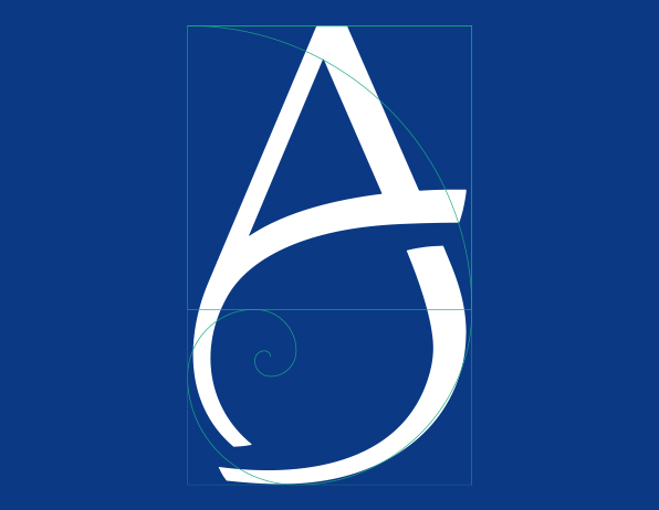
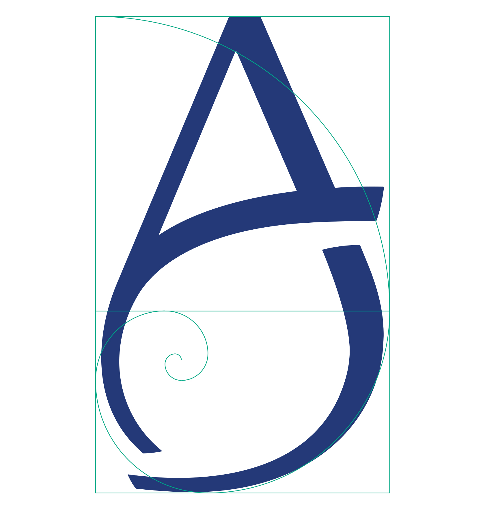
The brand
It is a letter “A”, the first letter of the brand name Angelini, with a circle that is open at the top and bottom. The diagonal lines create movement and evoke an embrace, representing a world, the Angelini world, that is always open, inclusive and welcoming. The colors are always blue, in the positive version, or white, in the negative version.
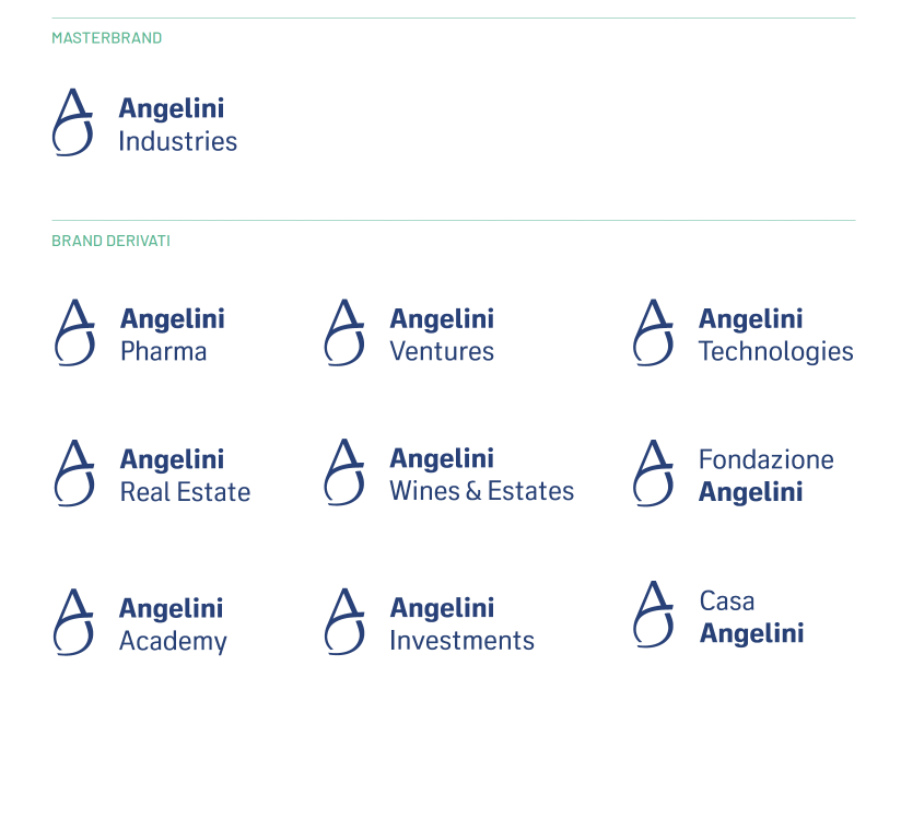
Brand architecture
Adopting the same vision, values and purpose also means presenting ourselves to the world in a cohesive and consistent way, representing all the companies of the industrial group as part of a single world. The architecture of our identity reflects this principle and requires each entity to use the logo, the Angelini brand name and a descriptor related to its field of activity. This, beginning with the master brand Angelini Industries, which represents both the parent company, Angelini Holding, and the industrial group as a whole.
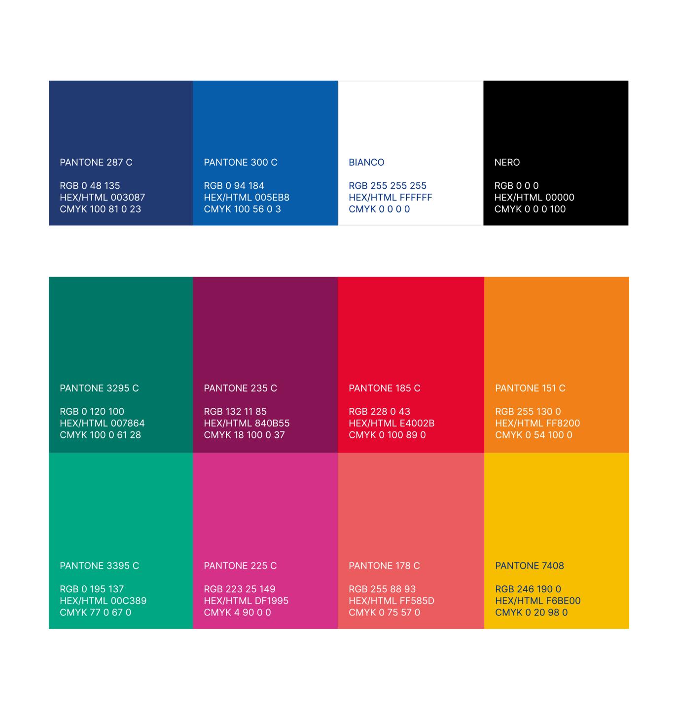
Our style: colors
We are a diverse Group and see the world from multiple points of view. This is why we want to be able to express ourselves in more ways than one, with an institutional color palette that complements blue and white with other shades of color, the basis of our brand language. The different shades of color and the combinations they generate allow us to cover a wide range of use situations in a very versatile way, from digital to print, helping to communicate our messages with the right nuances.
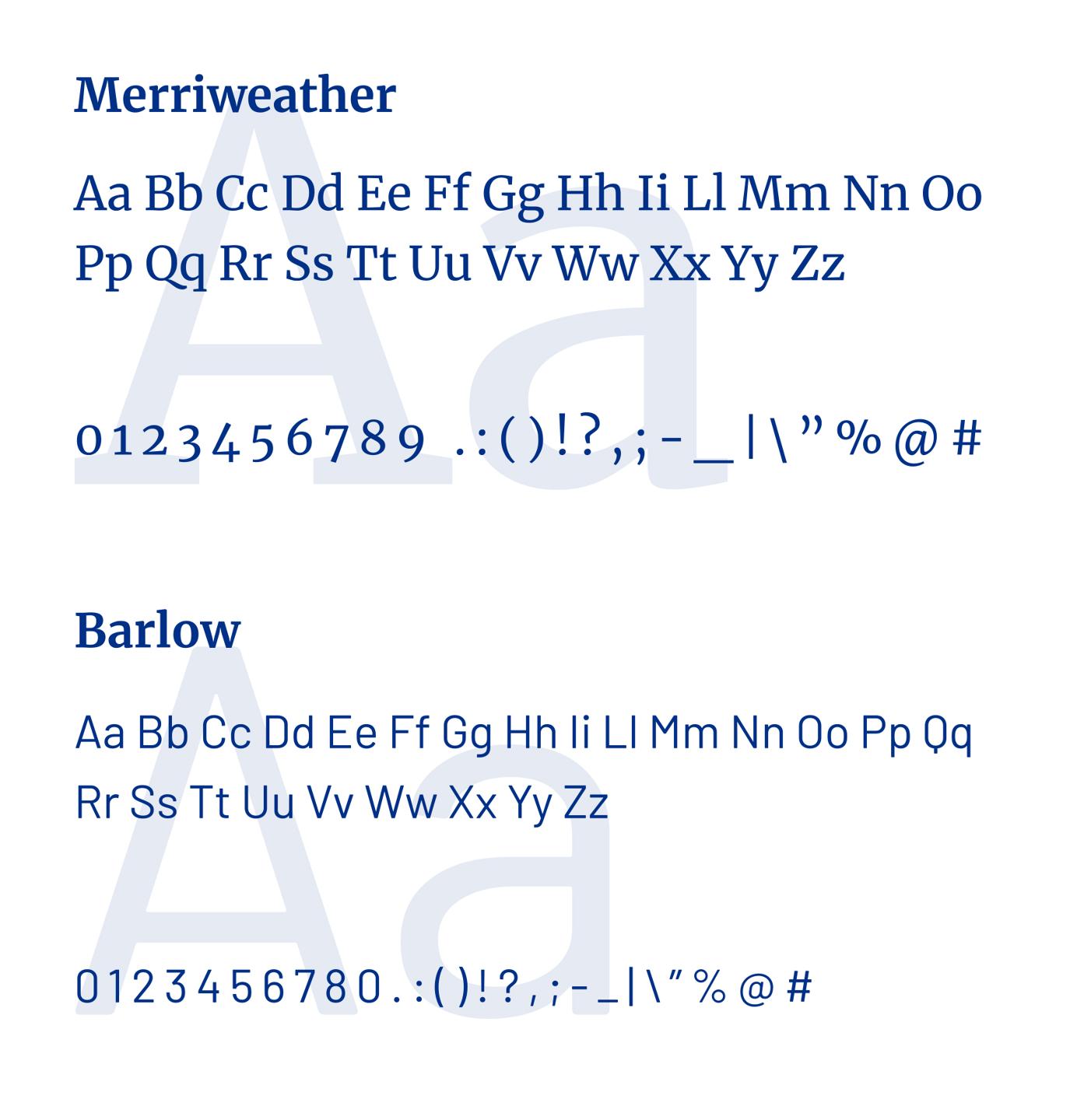
Typefaces
Words are important, and even their shape and design is too. Therefore, we decided to adopt the Barlow typeface as our institutional font. It is a sans serif and open source font family, which due to its different typographical weights, allows for wide use particularly for short texts in both digital and print. For longer texts, however, we chose another graced typeface, which is also license-free, the Merriweather.
Brand language
In visual communication it is always important that we are always recognizable, not only in the forms of expression but also in the values we want to express. The format is, therefore, as much a building block of the identity system as the logo can be, since it is what ensures the brand language’s consistency in every type of application. In designing it, we wanted to make use of and elaborate on the construction and semantics of the sign, extrapolating the ‘curves,’ real parentheses that emphasize the Angelini value bearing all the more.

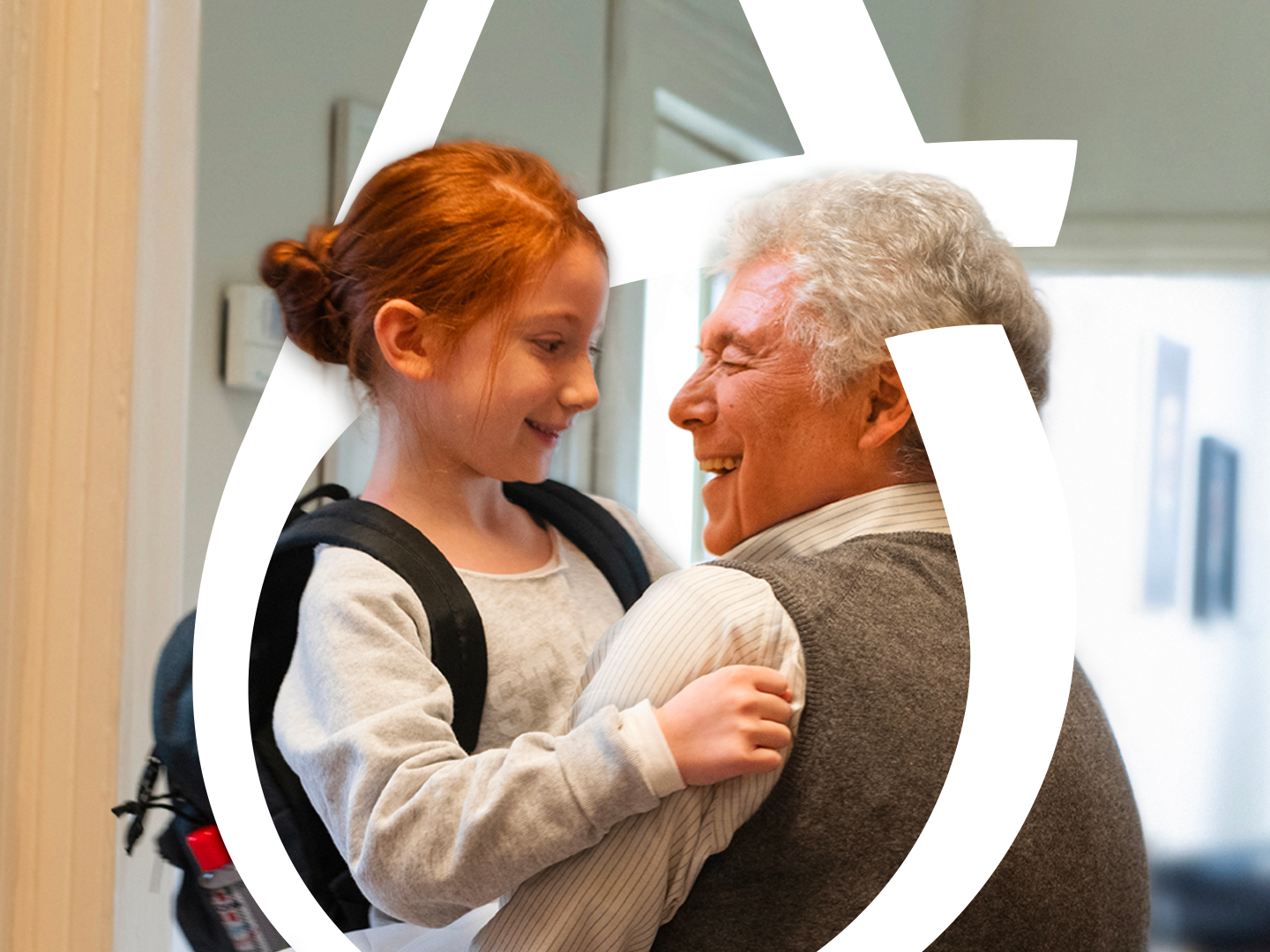
Photographic style
To support the visual narrative of our world of values, the photographic style recreates the dynamism of curves and embraces, providing for the choice of images whose physiognomy resembles the brand’s converging curves.

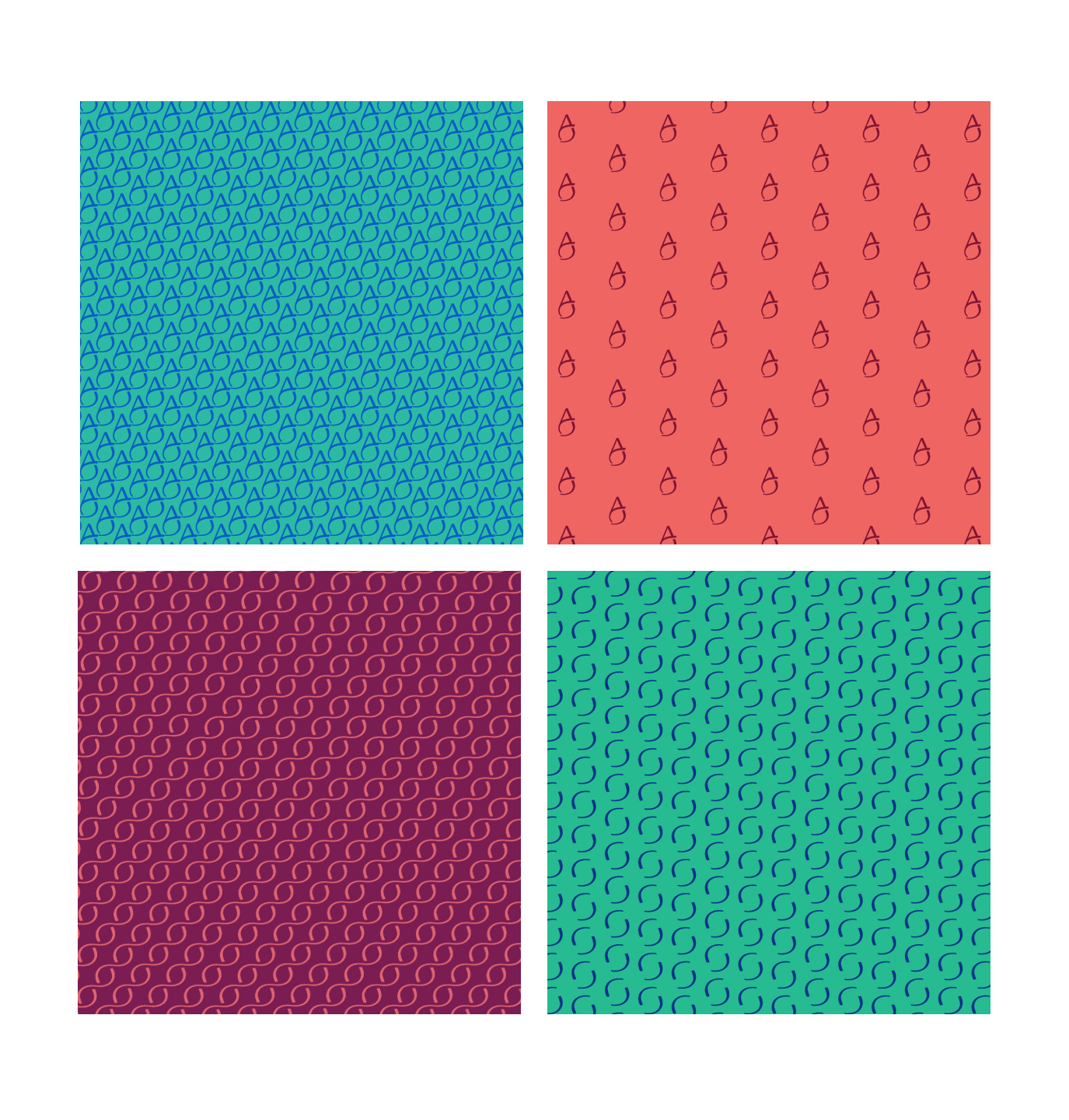
Graphic patterns
Taking advantage of the brand’s visual codes and colors, we have defined graphic patterns, which are developed from the sign or embrace, allowing for different combinations to be used on a variety of occasions: as a physical or digital backdrop, as a texture, as a decoration.